Tools I use for mobile web development
Table of Contents
It's never been easier to write web applications for mobile and I want to share some of the tools I use everyday that help me do so.
ngrok
ngrok is a tool used to create encrypted web tunnels to your computer in order to expose a local development server to the internet.
While modern web browsers have "mobile mode" dev tools, they don't perform as well as actually using the app on your phone.
My practice is to open the app on my phone and computer side by side, allowing me to make sure that the design looks great at all screen sizes.
Live reload
Live reloading typically involves a file watcher that triggers a browser refresh when files change on disk. Manually reloading the page is a pain, especially when you have your app open in multiple browsers and devices.
Luckily, many web frameworks come with built-in live reloading functionality.
The tools that I use often that provide this are Jekyll jekyll serve --livereload and the Elixir web framework Phoenix iex -S mix phx.server (it works without any extra options).
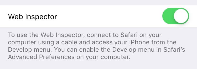
Safari mobile web inspector
I use the Mobile Safari dev tools to debug JavaScript and design in the browser when I'm running to problems with my applications on mobile.
To use the Web Inspector on your iPhone, toggle the following option under Settings > Safari > Advanced and following the instructions.
Tailwind CSS
My favorite tool for making mobile friendly applications is the Tailwind CSS utility-first CSS framework.
Tailwind generates responsive versions of all of it's CSS classes and provides custom at-rules to help with writing your own.
Here are a couple examples of responsive design using Tailwind.
<!-- progressively scale headings as the screen width increases -->
<h2 class="text-2xl md:text-3xl">
  Developing for Mobile Efficiently
</h2>

<!-- start as as a column and move to a row at medium size screens -->
<div class="flex flex-col md:flex-row">
  <div>1</div>
  <div>2</div>
  <div>3</div>
</div>
You can create your own responsive classes using the @responsive at-rule.
@responsive {
  .my-style {
    /* styles... */
  }
}
What else is out there?
I'm always interested in finding new tools, so if you use something not mentioned here, please share it with me on Twitter! @mitchhanberg