Announcing Temple v0.6!
Table of Contents
v0.6 of Temple has been released! 🎉
This release is the result of a few architecture changes that allows for faster rendering as well as many new features.
If you'd like to follow along with the code in this article, it's available here.
Compile time output of EEx
Temple now outputs EEx at compile time, allowing us to piggy back on the power of existing EEx Engines, such as the engines included by the Phoenix Framework. If you're using Temple with Phoenix, your templates should now be just as fast as the standard Phoenix templates, since the EEx output of Temple is piped right into the Phoenix template engine.
Compiling to EEx also means that Temple is now compatible with Phoenix LiveView! This is made possible by the same process outlined above, without having to re-invent any wheels.
Improved Component API
The current component API is module driven and comes with support for "slots".
Let's write a Card component to see how this all works.
A Temple component begins with importing the Temple.Component module, which brings us the render/1 and defcomp/2 macros.
defcomp
defcomp allows us to create a basic component within any module. The only limitation is that you can't define any functions inside of it, as the body of the macro is the markup of the component. Here we are creating several more components using defcomp, but you can use this macro anywhere. Under the hood, it defines a Temple component module.
render
render is where your component markup will go. Since Temple components are basically the same as Phoenix views, this macro expands into a render function that takes assigns, which you can access like @my_assign just like you would do in a normal EEx template.
slot
Inside each component definition, you'll see the usage of slot :default. This is the proper way to render the inner content of the component that is defined at the call site. slot is more like a keyword, as it is not a macro or a function.
defmodule TempleExampleWeb.Components.Card do
  import Temple.Component

  defcomp Header do
    header class: "p-4 border-b border-gray-300 bg-gray-50 rounded-t-lg" do
      div class: "flex items-center space-x-4" do
        slot :default
      end
    end
  end

  defcomp Body do
    div class: "p-4 border-b border-gray-300" do
      slot :default
    end
  end

  defcomp Footer do
    footer class: "bg-gray-50 rounded-b-lg p-4" do
      ul class: "flex items-center" do
        slot :default
      end
    end
  end

  render do
    div class: "bg-white w-full flex flex-col rounded-lg shadow-lg" do
      slot :default
    end
  end
end
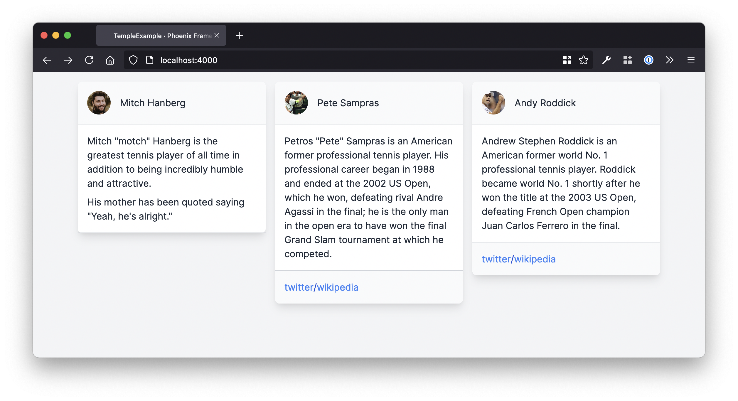
Here we've defined a Card component as well as Card.Header, Card.Body, and Card.Footer components. Now we can easily compose these components together to create a few cards.
c
We render a component calling the c keyword with a component module. I decided to keep this keyword as short as I could to make using components as ergonomic as possible. In the beginning, I wanted to be able to render them without any keyword, but calling a module like a function is not valid Elixir syntax, so I couldn't do that.
div class: "grid grid-cols-3 gap-4 p-4 items-start" do
  for user <- @users do
    c Card do
      c Card.Header do
        div class: "w-10 rounded-full overflow-hidden flex-shrink-0" do
          div class: "aspect-w-1 aspect-h-1" do
            img class: "object-cover", src: user.avatar
          end
        end

        div do: user.name
      end

      c Card.Body do
        text_to_html(user.bio, attributes: [class: "first:mt-0 mt-2"])
      end

      unless Enum.empty?(user.socials) do
        c Card.Footer do
          c LinkList, socials: user.socials do
            slot :link, %{text: text, url: url} do
              c LinkList.Item, url: url do
                text
              end
            end
          end
        end
      end
    end
  end
end
The Card related components all called slot :default to render their inner content, but as we can see inside our usage of LinkList within the Card.Footer component, we call slot :link, %{text: text, url: url}, why is that??
I'm glad you asked. The key feature of slots in my eyes is the ability for a component to pass data back into the scope of the caller.
Before, we were rendering a slot, whereas now we are defining a slot.
It's pretty easy to think of this in the context of a function that takes an anonymous function as an argument, like how you usually render a form in a Phoenix project.
form_for(@user, Routes.user_path(@conn, :edit, @user.id), fn form ->
  # markup and functions that use the form
end)
If we were to make a form component, we could use a slot to do the same thing. You can see in these examples that we can pattern match on the assigns that are passed to the slot, allowing us to easily rename a variable if we want.
Here's how we might make a form component that is compatible with how we're supposed to write forms in LiveView.
defmodule TempleExampleWeb.Components.Form do
  import Temple.Component

  render do
    form_for(@changeset, @path)

    slot :form, form: form_for(@changeset, @path)

    "</form>"
  end
end

# usage

alias TempleExampleWeb.Components.Form

c Form, changeset: @user, path: Routes.user_path(@conn, :edit, @user.id) do
  slot :form, %{form: f} do
    # markup and functions that use the form
  end
end
The nice part of slots is that we can have more than one and control exactly where they are rendered inside the component. Let's take another look at our Card.Header component to see what I mean.
defcomp Header do
  header class: "p-4 border-b border-gray-300 bg-gray-50 rounded-t-lg" do
    div class: "flex items-center justify-between" do
      div do
        slot :left
      end

      slot :default

      div do
        slot :right
      end
    end
  end
end
Now we can slot (😅) some markup into specific parts of the component.
c Card.Header do
  slot :left do
    div class: "w-10 rounded-full overflow-hidden" do
      div class: "aspect-w-1 aspect-h-1" do
        img class: "object-cover", src: user.avatar
      end
    end
  end

  slot :right do
    SVG.verified_icon()
  end

  div do: user.name
end
What's Next?
While Temple has certainly come a long way, there are still many improvements to be made! The ones that I can immediately think of include:
- Fallback content for slots
- Allow multiple instances of a single slot name
- Use a component as a "typed" slot
- Improve stacktraces. Currently if something goes wrong, you might see errors/warnings being rendered on the wrong lines.
- Writing guides. The hex documentation is alright, but doesn't really teach you how to use Temple.
- Write a "component library" a la something like React Bootstrap
- New logo 👨🎨
Related Reading
- Temple, AST, and Protocols
- Introducing Temple: An elegant HTML library for Elixir and Phoenix
- Release Notes